Choosing A Colour Scheme For Your Event
How important is the appropriate use of colour when planning an event? Will the use of colour contribute to a successful occasion? Does colour affect mood or evoke an emotional response?
These are important questions to think about when choosing not only décor, but also flowers, lighting and accessories for a perfect occasion. Traditionally a wedding reception will probably continue the bride’s chosen colour theme with the use of co-ordinated floristry, napkins, menus, décor and lighting etc, taking into account seasonal trends in both colour and foods. Equally, cultural differences should also be considered. For example, a Chinese New Year celebration should never incorporate the colour white.
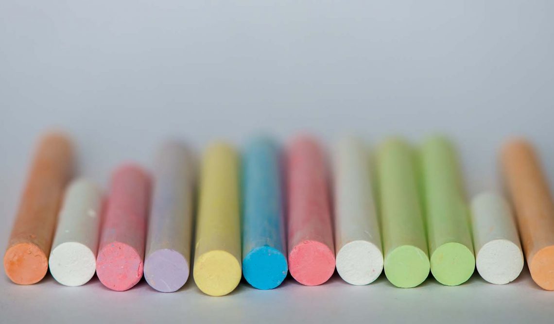
Spring colours portray a light breezy atmosphere with pastels such as yellows, lilacs and pinks, whereas winter colours include deeper more vibrant hues of purples, burgundy and intense reds.
CONVEYING THE CORRECT MESSAGE
Companies spend a lot of time and effort on their branding; their message. Similarly, when you’re planning an event, you’re creating memories. Getting the mood, atmosphere and colour scheme correct will set an important foundation. Here we examine the psychology of colour when establishing a mood or an image.
Red: Red evokes passion, excitement and grabs attention. Perfect for an event where guests are encouraged to move throughout a venue. It’s a dominant colour, often associated with love – a perfect colour for a Valentine’s ball.
Orange: Orange is a vibrant colour with a strong sense of energy and excitement. Used with a combination of black and white it becomes outstanding and authoritative. Good if you wish to portray confidence for a business event, but best used in subtler shades for family occasions.
Yellow: A great choice for a breakfast or brunch event as yellow increases metabolism. A warm, yet cheerful colour, it signifies warmth and energy but it’s important to consider the best shade for your venue, as yellow can conflict with lighting.
Green: Green is a stress relieving colour. It’s tranquil, calm and soothes. Ideal for staging performance related events. It’s also the colour of nature and environment and therefore perfect for a beauty or health related company event.
Blue: Blue symbolises peace, trust and loyalty. A neutral colour known to create productivity. A good colour to use for a product launch, although do take shades into account when considering blue for an event as darker shades can create a sombre mood.
Purple: Purple is associated with extravagance and luxury. The use of purple will convey a rich, regal mood. It’s spiritual and magical and often used in the entertainments industry to convey this effect.
Black: The use of black is appropriate for sophisticated corporate or black tie events, but if overused can portray a sombre or mournful atmosphere.
White: White creates a sense of space and is therefore best suited to small or darker rooms. It’s clean, pure and innocent colour but best used with a contrasting colour to avoid too much of a clinical feel.
Colour will naturally enhance your event. Matching table linens, fabric draping, chair covers and sashes, lighting, décor and table centrepieces will all contribute to creating an occasion to remember. We are always available to advise on the best use of colour schemes and offer a wide selection of hire furniture and accessories to ensure your event sets an appropriate scene.
Leave a Reply