Pantene Colour of 2020 is Classic Blue: How to use it in your home
Pantene have named their Colour of 2020 as Classic Blue. The name and colour are said to indicate a fresh start to the new decade. With that in mind, we thought we would show how easy it is to use the new Pantene Colour of 2020 in your home.
Pantene Colour of 2020 Classic Blue
How to use it in your home
Go Bold
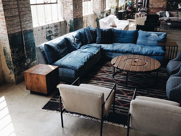
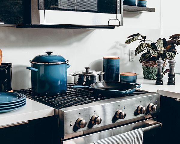
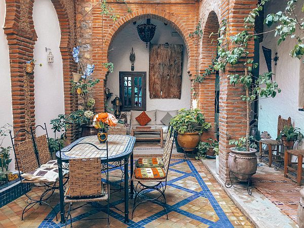
As with any primary colour, blue works well if used as bold strokes. Think a solid base colour for one wall, or a large item of furniture in classic blue. For example, the main wall in a living room can take a bold colour such as classic blue. Or you could incorporate the shade by introducing a statement-making sofa in blue. In other parts of the home, why not use blue for the stair carpet? In addition, blue brings depth to neutral colours, particularly on items you wouldn’t associate with the colour, such as kitchen cabinets or lush bed throws.
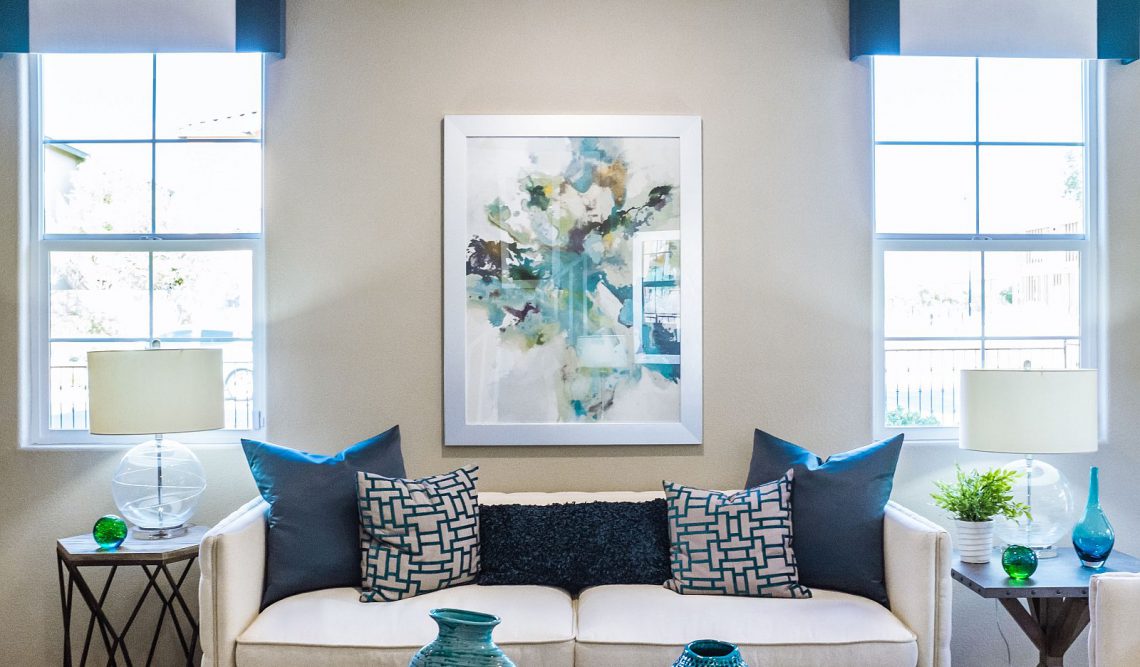
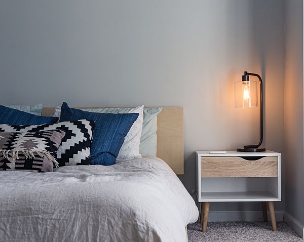
Accent colours
If you don’t want to be bold, use classic blue in accent colours around the room. People often think of just using blue in bathrooms, but it provides a lovely expensive air when used in moderation elsewhere. For instance, hang paintings with a hint of the same blue in the living room. Place throws and cushions with this colour in prominent places. Pots in blue compliment the greenery of the plants they hold.
Colour combinations
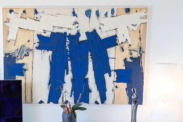
If you are using blue for the first time stick to having it as accent colours and pair it with white. Blue and white are classic colour combinations and provide a nautical feel. However, this look can feel a little cold and stark. If you don’t want to go all-out sea-worthy, or, if you want to warm it up a bit, simply add some neutral tones such as caramel or tan. In fact, gold and green work well with blue. But don’t be afraid to use contrasting colours such as pink or orange too.
Stripes
When we talk of the colour blue we often think of white and stripes, again, returning to the nautical theme. But stripes and blue are also synonymous with Breton. Breton stripes come from the thick, striped, blue and white shirt sailors from Bretagne would wear. This was so that they could be easily spotted in a sea emergency. Now the Breton stripe is more associated with fashion and design. Use it on accessories such as rugs, cushions, bed covers and pottery.
Metallics
Speaking of gold, if you want to create a luxurious vibe to your pad, adding touches of gold gives an illusion of expense. This is easy to achieve; you can add gold accents with ornaments, lights, picture frames, or on furniture. Gold gives a sense of tradition and age when paired with classic blue. For a more modern atmosphere try silver. Blue and silver teamed with glass are thoroughly modern. Add touches of white or grey to keep to the modern scene.
Fifth Wall
Walls are not just for art. For those of us not in the interior design industry, the fifth wall is the ceiling! And classic blue is the perfect choice for this additional wall as it reminds us of the sky. We are not suggesting you paint your ceiling in blue then dot it with neon stars. But a blue ceiling creates a restful quality that might even help you sleep.
Look to the classics
Finally, and our last tip for using the Pantene Colour of 2020, Chinese porcelain and Wedgewood have both implemented classic blue in their designs for decades, if not centuries. When displaying items, group them together if you have a few pieces and mix with modern items for a balance of traditional and contemporary. Even better, create a display using a mix from Cornish or French striped bowls, chinoiserie plates or delft bowls.